Bridgerton stairs Pt. II: Choosing color
stairs are probably the most annoying thing we’ve changed in the house. basically, you cut off access to moving between floors. For adult humans, that’s mostly manageable. With dogs, it’s possible but you better be quick or keep ‘em on the first floor for an emergency outside break if need be. For cats? forget it. you’ll have to close them up in a room to be sure they won’t decide to traverse the stairs at just the wrong moment. (Kids? Idk - you tell me. I imagine it’s difficult to say the least!)
We’ve painted stairs a total of three times. One time for the upper level stairs, twice for the stairs connecting the first and second floors.
The first time we painted our ground level stairs, we chose agreeable gray shades with white accents. It looked cute and reminded me of a de-saturated cake. The gray was done while we were still renting, and we chose the color to at least argue, if challenged, that we made a net improvement that would be on-trend and/or timeless.
After we bought the house, that gray started looking pretty drab. I knew it didn’t fit our style, and I wanted to change it, but I couldn’t think of any new ideas. How to infuse color in such a narrow space? plus, it’s the first thing people see of our home’s insides - what pressure!
Then... I watched Bridgerton.
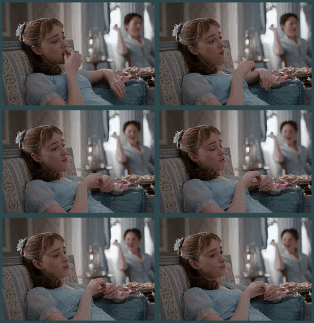
me watching bridgerton wishing that my house was also pale blue and cute as a button
I couldn’t stop thinking about recreating the eponymous house’s colors in our entryway. Oh, what a joy it would be to have such a bright color greet us as we come home!
But I also wanted to add my own little spin to it, of course. So I got all the bright blue paint samples from Lowe’s and clare.com and taped them up along the wall to see what fit best. The trick to choosing color is in recognizing how inconsistent that color will be from hardware store lighting to the natural and artificial light in your own home.
Side question... is there anything artificial about the light coming from a lamp? what does that even mean? it’s still light, right?!
Ok before I get too into that question let’s finish out this other thought.
How to critically evaluate paint swatches
In order to understand how the color will show up in your own house, follow my foolproof swatch process:
at the paint/hardware store, make sure you get a variety of shades close to the color you’re looking for. This will pan out for you, because once you get home you may see the lighter color you were looking for registers as washed out, or even too dark, in your home’s lighting. You’ll be glad to have some close-in-color options to examine!
tape them literally to your wall using painter’s tape. why? those swatch babies are gonna need to just park it onto the wall a while while you take a good look as you...
examine all those options over the course of an ENTIRE DAY. Seriously - morning light, afternoon light, evening sunset, the overhead lights or lamps you use at night. All of it. The color is going to register differently in all of these instances, so make sure you like the way it glows and fades with the light it’s receiving.
here’s what I ended up with after the swatch process:
the kicker, of course, is... what do you look for while you’re spending the day staring at a wall covered in paint swatches?
so let’s take a step backwards...
How to even decide on a color in the first place
My advice is to look for an emotional connection with the color.
No, seriously!
find a color that makes you feel what you want to feel when you are in the room. For example...
living room = chill, cozy = grays, blues, greens, lavender
dining room = hungry, sociable = reds, oranges
kitchen = fresh, healthy vibes = greens, yellows
office = focus, productivity = saturated warm or cool colors
bathroom = zen, relaxed = greens, blues
bedroom = the most you, but relaxed = your favorite color in a light or deep shade
You get the idea.
The biggest piece of advice I can provide you without actually helping you through a design project IRL (which would be very fun, if you’re into that) is to go with colors you love, colors you feel something for, colors that make you remember a great time in your life, or a room you’ve always admired. Get creative with your color palettes and use the “rules” as a gentle guide, not an exact blueprint. Always allow yourself (not design IT-people) the final say.
How this showed up in the bridgerton stairs
So my Bridgerton stairs came to life after narrowing down a dozen shades of blue to the right vibrancy for our dark as heck entryway. here are the shades that made the cut. I also learned what a banister vs. baluster was after labeling these so just know everyone is always learning, life is a grand journey of gaining and forgetting and misremembering knowledge:
stairs base = deepest ombre color for baluster, riser
banister 1 = middle color for baluster
hall bottom = lower wall
banister 2 = lightest color for baluster
hall top = upper wall
handrail and chair rail = swirling water (not pictured - we matched this to our trim around the rest of the house, which is a Behr’s color I asked them to colormatch at lowe’s)
The ombre was a bold choice. Oh, no, not because of the color. Because of the sheer amount of detailed painting I was going to have to do.
footage of me determining that ombre-ing the balusters was an excellent course of action
seriously though.
it was painstaking, but I was able to enjoy many a netflix show and podcast while dabbing the above brush, and many others, all over and round these tiny little crevasses and outcroppings.
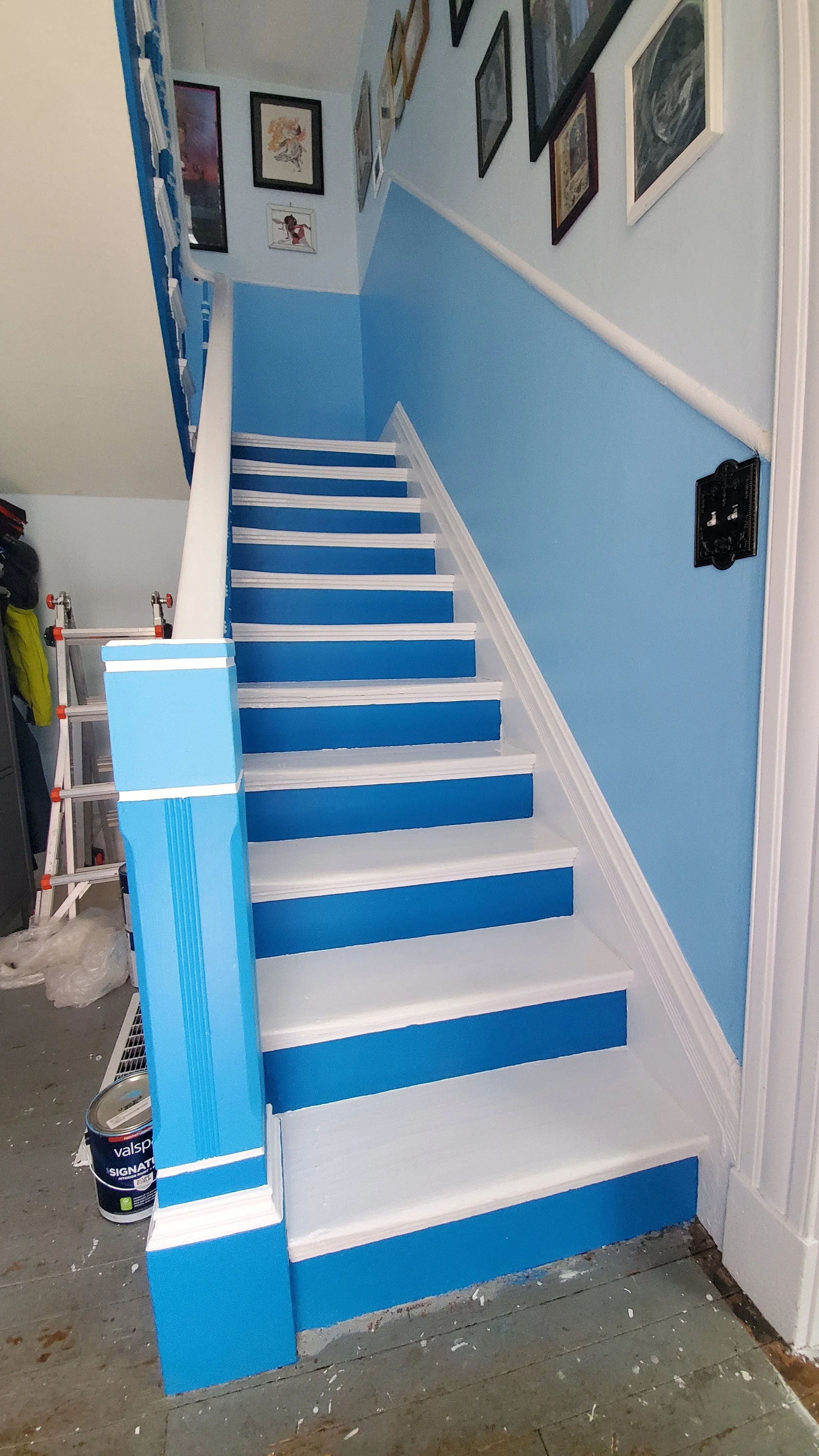
In the end, I would say it was worth it to achieve this bright and cheery greeting right behind our front door:
I liken going up and down the stairs to diving into a crystal-clear pool. It’s quite nice.
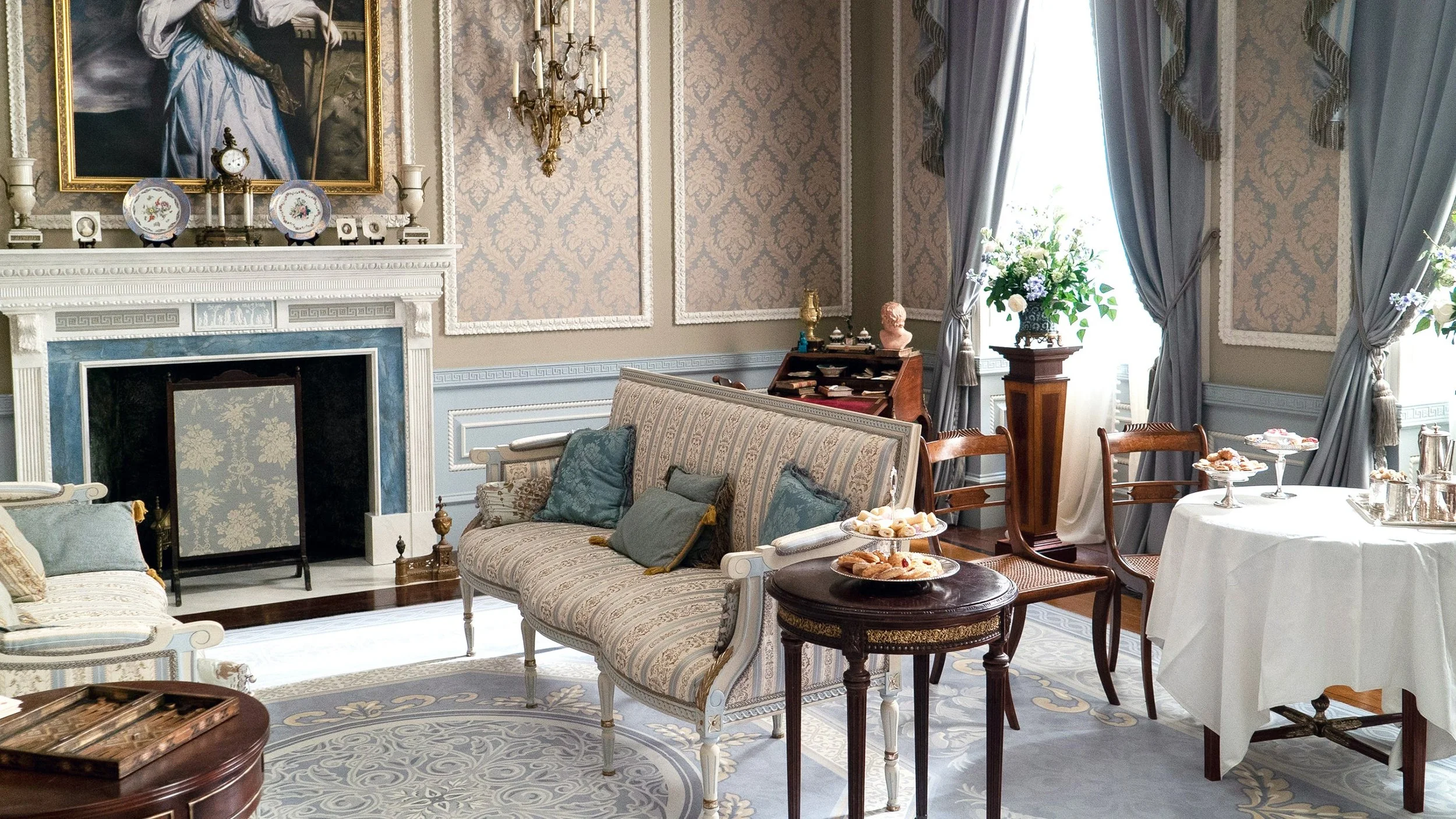
here is the Bridgerton house (photo source: Glamour uk) for comparison -
see how I made my own colors much more deeper and more vibrant on the baluster, but kept the pale shades on the walls? that’s because, no offense, I am no proper english rose, I am a wild and bold arteest, ok?
Next time, I’ll share how I chose carpet treads (my least favorite thing to shop for, ever, and I’ll tell ya why) and a runner for the stairs to minimize slippage for our aging dog and also anybody wearing socks.
CHEERS!!


