Home frogffice
The brief:
My client and friend is a new dad looking for a space to work, write, game, do yoga and read. He’s not sure on budget but wants to keep most of the furniture or move it from other places in the house. What he needs help with is tying the room together and creating a space that works for work, relaxation and play. The design process:
Step 1. Color
I knew he wanted to learn how to paint the room, so to make sure we were working from the get-go off a palette he liked, I sent over some color options digitally and we narrowed down the vibe he was looking to achieve.
When we had a few top choices, I brought over color swatches from the hardware store to tape to the walls. I told him to take a look at them during all times of day, and in both natural light and artificial light. I snuck in a bolder color than what he asked for initially, because I had a feeling it would be in the running to win him over.
I was right hehe. We went with that one second from left: a deep seafoam green.
Step 2. Layout
With the color nailed down I felt ready to tackle the rest of the space. I’d been playing around with the layout while we worked through the color options, and now all I had to do was add in the specifics.
I love to draw - it’s something I’ve been doing since I could hold a pencil. So for me, drawing the room is an essential step in getting to know the space. (It’s also super helpful because I haven’t learned any rendering software yet, and I need something to help the client visualize the space the way I see it in my brain. Words get me most of the way there, but a picture’s worth a thousand of those, so, voila.)
I had started the layout based on what I knew he already had set up and what furniture he wanted to keep. Sidenote, I LOVE when a client wants to use existing furniture, because it means we’re avoiding buying something new and adding to the cycle of immense waste in the home design industry.
He liked where the desk was, and the room already had a couple clear zones for work and relaxation. Area rugs are a great way to demarcate spaces in a room - I was seeing three. One for work, around the desk; another for relaxation, under the chair and ottoman; and a third for entertainment which would run in front of the sideboard that matched the taller shelf that was already in the space. (He was thinking about a wall-mounted TV so I left room for that to happen eventually.) I sketched those zones in with rugs.
I moved the taller shelf out of the corner where it wasn’t freely accessible behind the chair and ottoman, and simplified that space to let what I hoped would become a gallery wall breathe. In that corner I just left the chair, ottoman, side table, lamp and rug. Perfect for focusing and relaxing. I also knew he collected prints from independent artists, so I built in space for him to display and evolve that collection on the wall behind the reading area.
Part of my design process is thinking about the space over time - not just in the moment the design is finished, but how the client is going to build their own style into the space going forward. It was important to me not to rush to find a bunch of art that spoke to the client right now.
Back to the furniture: In the opposite corner, the tall shelf felt better - it brought a nice viney pothos plant with it too. Along that wall I added the sideboard, record setup, and room for a wall-mounted TV so he could play PS5 (swoon!).
This is the initial sketch I’d ended up with before we had picked out the final color:
After we decided on the seafoam green, I knew I needed to play more with the orange and white hues in the room. I thought a deep blue would be a good fourth leg so to speak, and keep things feeling natural and relaxing. I found three rugs that echoed that palette and bounced those colors around the room in a way that felt balanced.
I also learned that my client was ready to wall mount a TV above the sideboard (heck yes) and that he had a record player ready to add there too. Here’s how I edited the sketch to incorporate the new color palette and items:
Step 3. Stuff
The colors of the walls and rugs were a good start - making decisions about palette and texture always helps me shift into thinking about the actual *stuff* in the space.
I went with two Ruggable brand rugs, as my client’s family includes a baby, a baby-to-come, a dog, and two cats. A washable rug is going to come in handy!
The third rug was from WellWoven - Ruggable didn’t have anything with fringe, and I felt like the big blue rug should be a little more textured and have some fringe to balance out all the smoothness in the room.
I was very excited about a surprise I had up my sleeve for the client. Since he’s a friend, I knew a thing or two about his life already; namely, I knew he loved frogs and playing tabletop RPGs.
At Summerfair, a local art festival in Cincinnati, I’d found an incredible painting of a frog bard. It already echoed the colors we were heading toward too - the green, orange and white especially. I knew this would be perfect to start the gallery wall behind the reading chair.
He also asked for a pegboard behind the desk to put things that were important to him - give him a little Zoom background in the process. That was an easy find; he already had one from Ikea in mind for all its accessory potential (cups, bungees, and hangers, oh my!).
Ok - there was a lot going on in this room. I needed something to make sure that when he was working or relaxing, he wasn’t staring directly into the area intended for the opposite.
To solve for that, I considered a folding screen, or a curtain. I wasn’t loving the opacity, and it would butt up perpendicular against a window, bisecting the view.
Ultimately I thought we needed something that wasn’t so visually heavy that it would feel like a literal divider. Something that was more a suggestion.
So I came up with my most favorite part of the design: I added a beaded curtain in front of the computer space. This would still let my client see through to the door if someone needed his attention, but it would create a visual separation at the same time to help him focus. To remove the curtain, he could roll it up to the ceiling and fasten it with straps.
I couldn’t find any straps that felt like a reasonable price. My persistence paid off when I found Corro, a site for stuff you need caring for a horse. I found stirrups for Three. Dollars. Ok, but what was Corro, and who am I about to give my client’s money to? When I looked into the company, I saw that not only were they proud to call themselves “horse people,” they supported the Compton Cowboys, a group that helps combat stereotypes and provide a positive environment and hobby (horseback riding, obvs) for kids who need one. Ok, sold. (Honestly, felt kind of like a jerk for buying something that was just $3.)
I love when I can find an unconventional use for something with a specific purpose… almost as much as I love finding a new company that is clearly made up of people who care about what they’re putting out into the world.
Ok, hopping off my soapbox before I get too swept away.
This is what I ended up with for the final sketch!
The transformation:
Now it was time to buy the stuff and collect it for the big day. While we were waiting for the items to arrive, we scheduled time to paint the space. Painting was especially fun, because my client wanted me to teach him how to do it! He was there to help me get the work done, which is, I’m assuming, a super rare occurrence in interior decorating. I brought my partner along as my assistant, which was also really fun. I felt like a real project foreman.
We knocked the painting out in a few hours and my client and his wife were super sweet to buy us lunch and make time to connect as we refueled. Being me, I took the opportunity to clean up while everyone was digging into their lunch and then joined in after. These are the perks of designing for your friends!
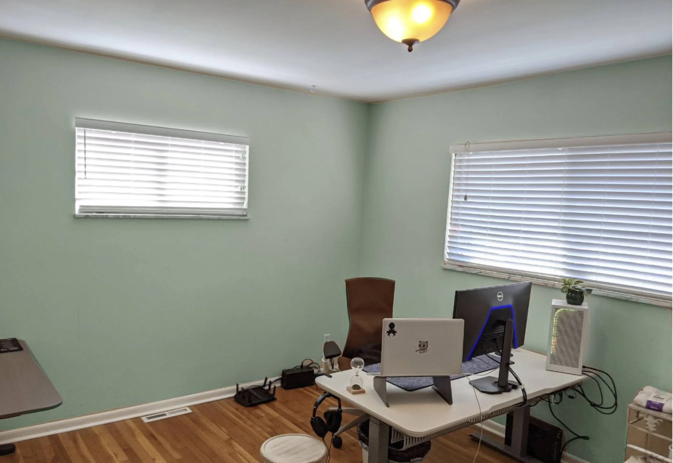
The paint alone made a huge difference - the whole space seemed to come alive, the floor looked more honey-colored, the light bounced around in a completely different way. I loved it, and importantly, so did my client!
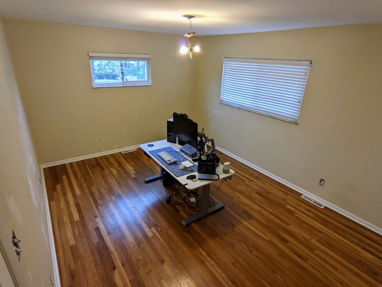
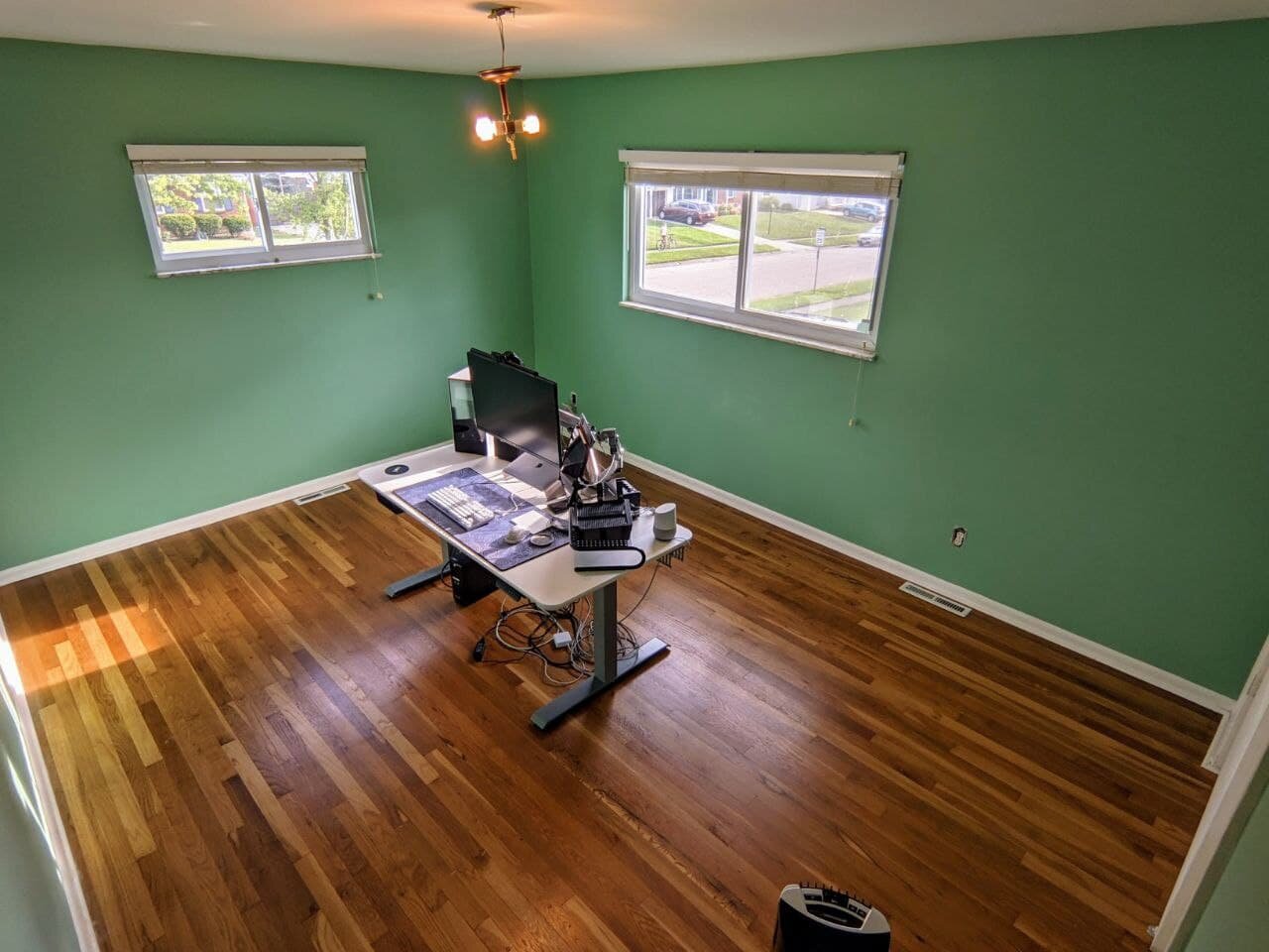
The day of the install arrived a couple weeks later. Again my trusty partner came along to assist. This time, it was all about unboxing and laying things out. We were floored when we saw my client had already hauled the heavy furniture upstairs! There wasn’t much to do besides lay down the rugs, install the beaded curtain and do some final staging touches.
...Oh yes…
And present the surprise frog bard!
That was a hit. We hung up the bard and the pegboard, and got to work laying out the rugs.
The beaded curtain went up without a hitch. Once I saw it in the space, I knew my gut instinct had been right and I wished we could have gotten two… it wasn’t quite draping across the whole desk area like I envisioned. And it was totally impossible to roll up vertically without additional adjustments.
To solve for that, we used the straps to tie it together like you would any other curtain - just a loop around the middle. My client said he liked the fact the curtain didn’t cover it all - he wanted specifically to match the curtain’s location to his eyeline from his desk to the door.
Ok, roadblock navigated, and room put together!
Here are the final pics we took of the space:
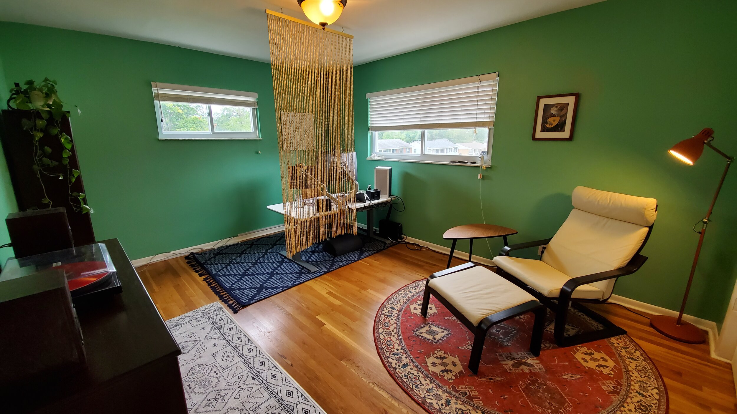
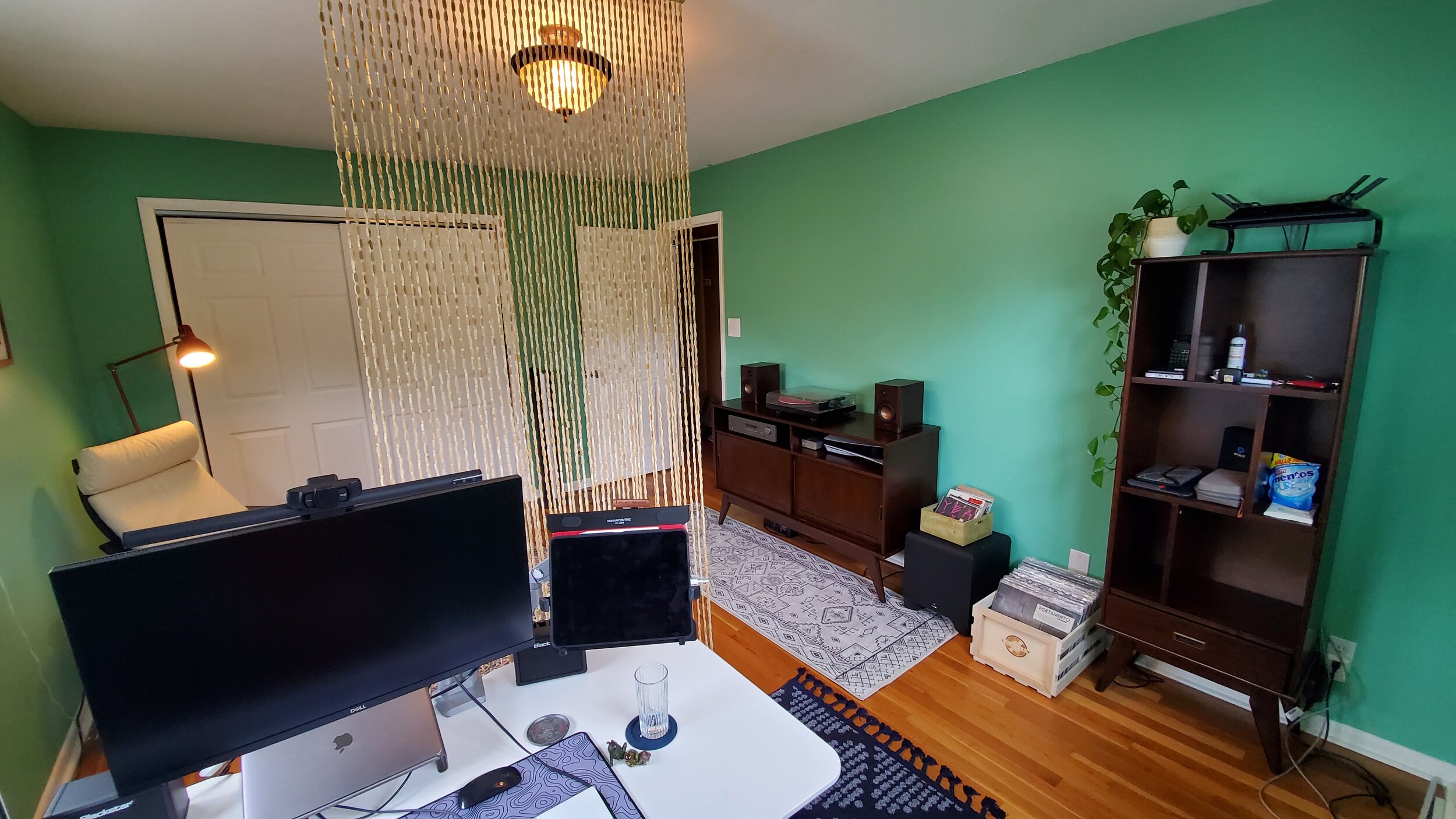
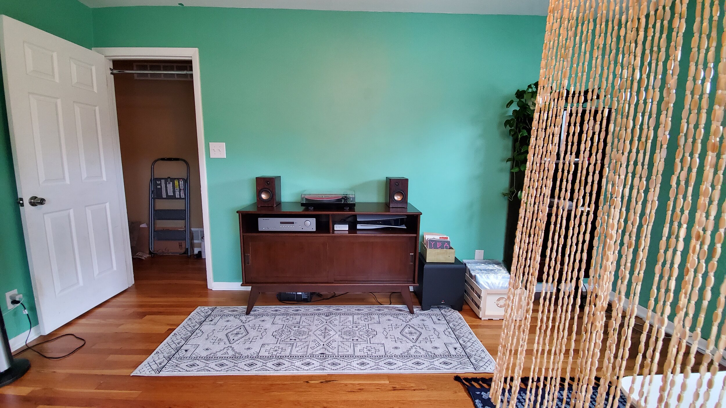
And then a little ways later he sent me these pics of the pegboard and the wall-mounted TV.
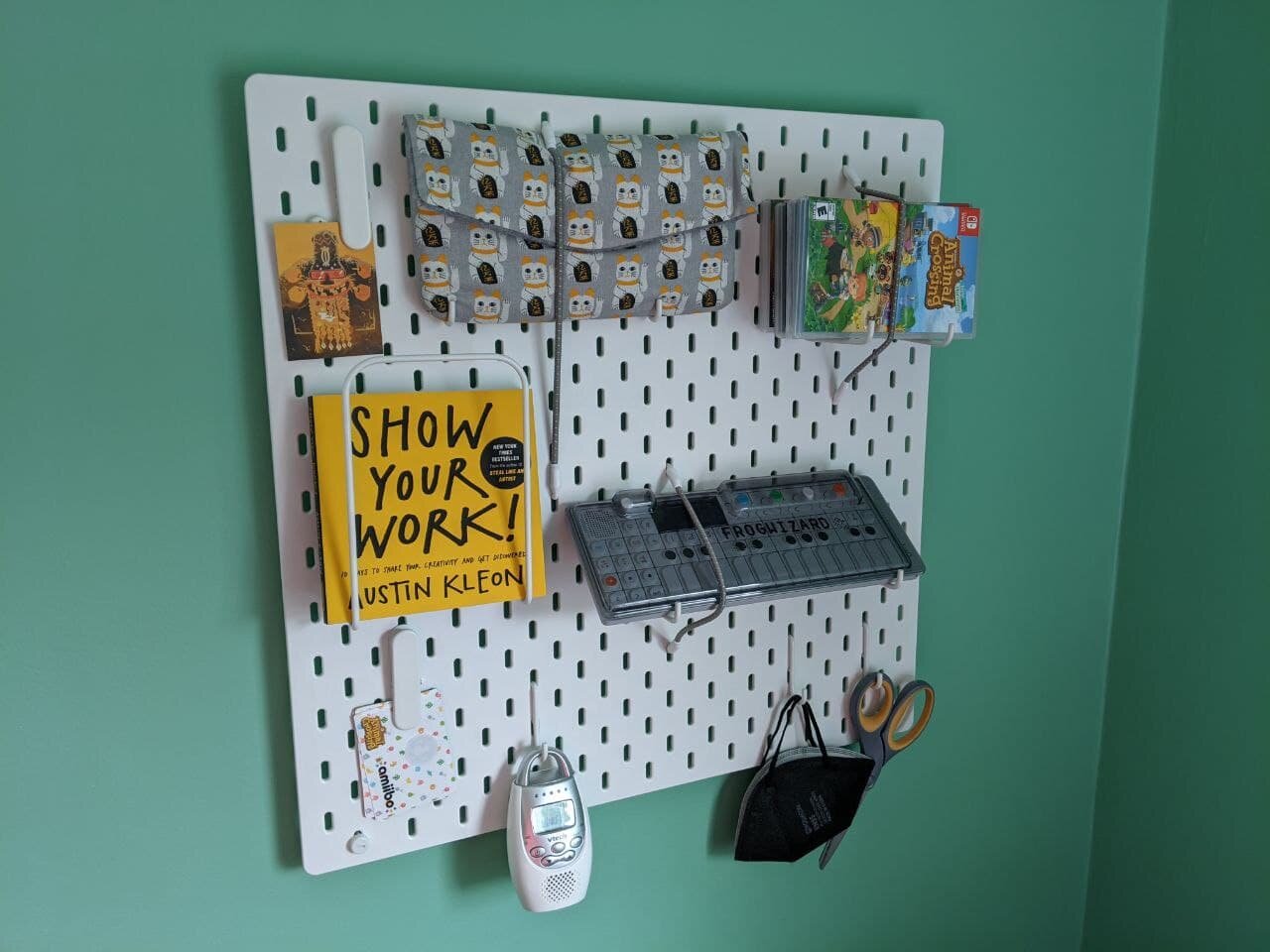
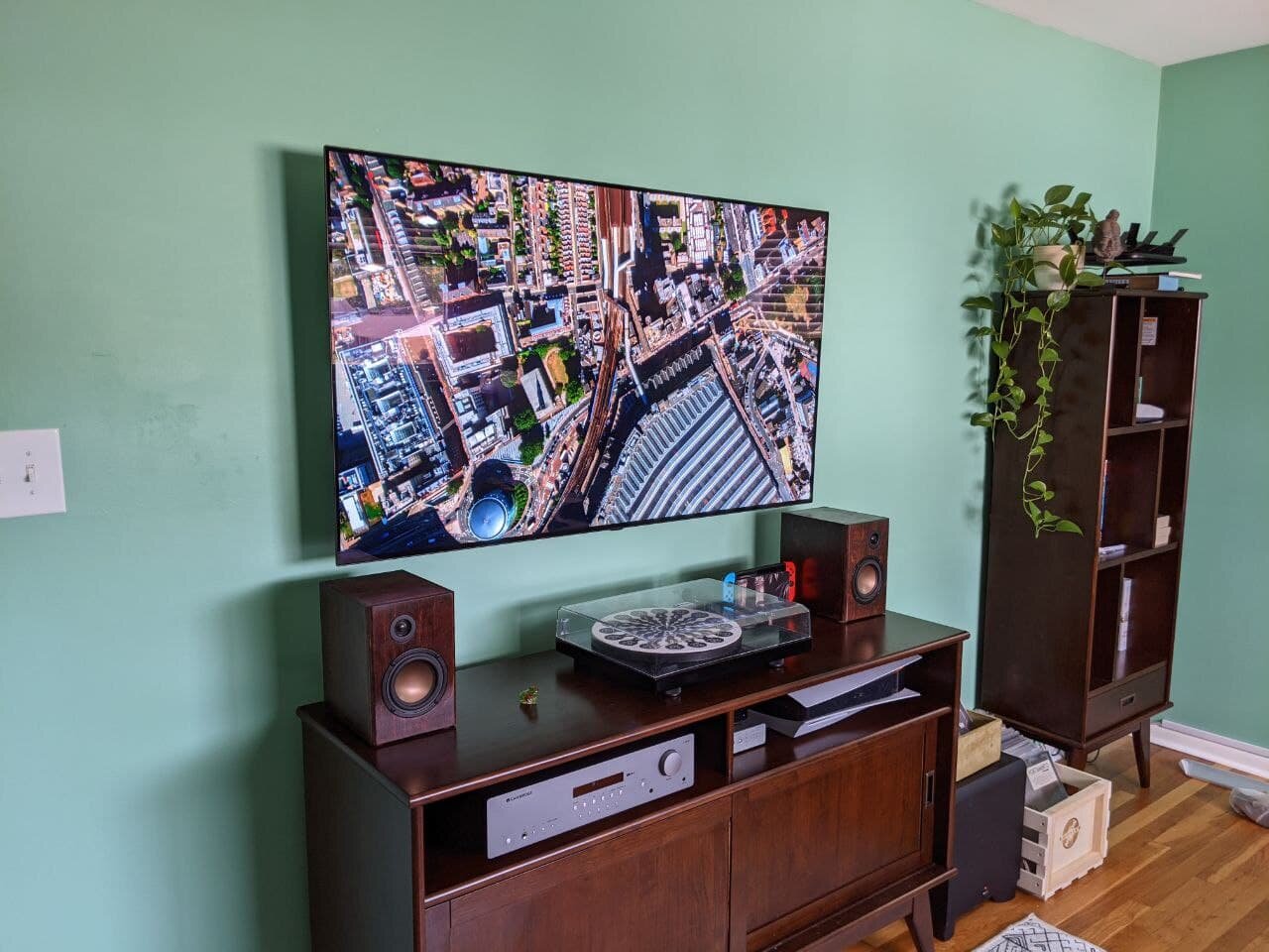
Seeing my sketch come to life was a pretty cool experience. I had done another design already, and of course seen things come together in my own house. But the first design was remote, and so I wasn’t hands on throughout the process. The stuff in my own home was stretched out over lots of time and mini-evolutions vs. one crisp sketch to reality. This was something special!
Sources and notes
Pegboard from Ikea. Ikea rates pretty well for ethics, which can be a nebulous definition in and of itself. You can find a nice overview about Ikea from The Ethical Home Edit, which approaches ethics based on what a company is doing, not what they are aspiring to do.
Beaded curtain from Amazon. This one was a price decision through and through. Handmade options on Etsy were at least twice the price and I was running low on budget room for this project. Unless the client asks for it and has the budget and time to support it, my goal isn’t to have everything in the design 100% ethically “pure.” Is that even possible? I think I would go 100% insane trying to quantify the morality of one decision over another. Instead, I want to get absolutely as close as I can to matching my and my client’s values within time and budget parameters, and get better with every design by learning about different options, and the timing and budget required to use them. Anyway, this curtain was sold by FlavorThings, which as far as I can tell isn’t really a company so much as a brand that makes random household goods. Lack of info, to me, is sketchy in and of itself. At least I used Amazon Smile and the League for Animal Welfare got some change.
Leather stirrups from Corro. Corro was new to me. I’ve never even ridden a horse! Corro is proud to call themselves “horse people” and focus on products for horses and their riders. They also support the Compton Cowboys, a group that helps combat stereotypes and provide a positive environment and hobby (horseback riding, obvs) for kids who need one. Did this balance out the leather used? These are the trolley problems I will never solve.
Paint from Lowe’s. I went with Valspar paint and painting supplies from Lowe’s. If I need something from a large hardware store, Lowe’s is my first choice as it’s one of the few Fortune 500 companies helmed by a Black man (one of only four Black CEOs as of February this year).
Rugs from Ruggable. Being washable, the idea is that Ruggable rugs are inherently more environmentally friendly than non-washable rugs. Fair enough. They’re also manufactured in the USA, which cuts down on shipping cost and environmental impact. When possible, Ruggable says they use recycled materials. Their rug pads are at least half recycled materials. In addition, they plant trees to offset their carbon footprint.
Rug from Well Woven. Well Woven is their own rug manufacturer, which helps keep costs down and cut out steps other companies need to take in between, especially shipping costs and impact to the environment. Their factories are Business Social Compliance Initiative (BSCI) compliant which includes human rights considerations, fair wages, and minimal environmental impact.


